Client
Het Kwartje

First phase
The original concept
The original concept was to create a new liqueur meant for bigger shot bottles to provide better value for consumers.
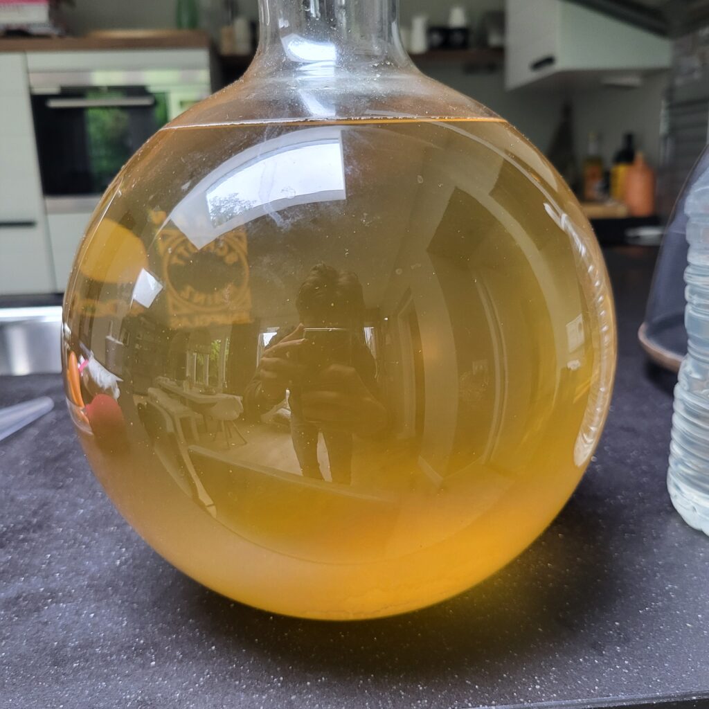
My prior experience with flavours, fermentation, and alcohol production allowed me to complete the recipe in just 3 months.
Second phase
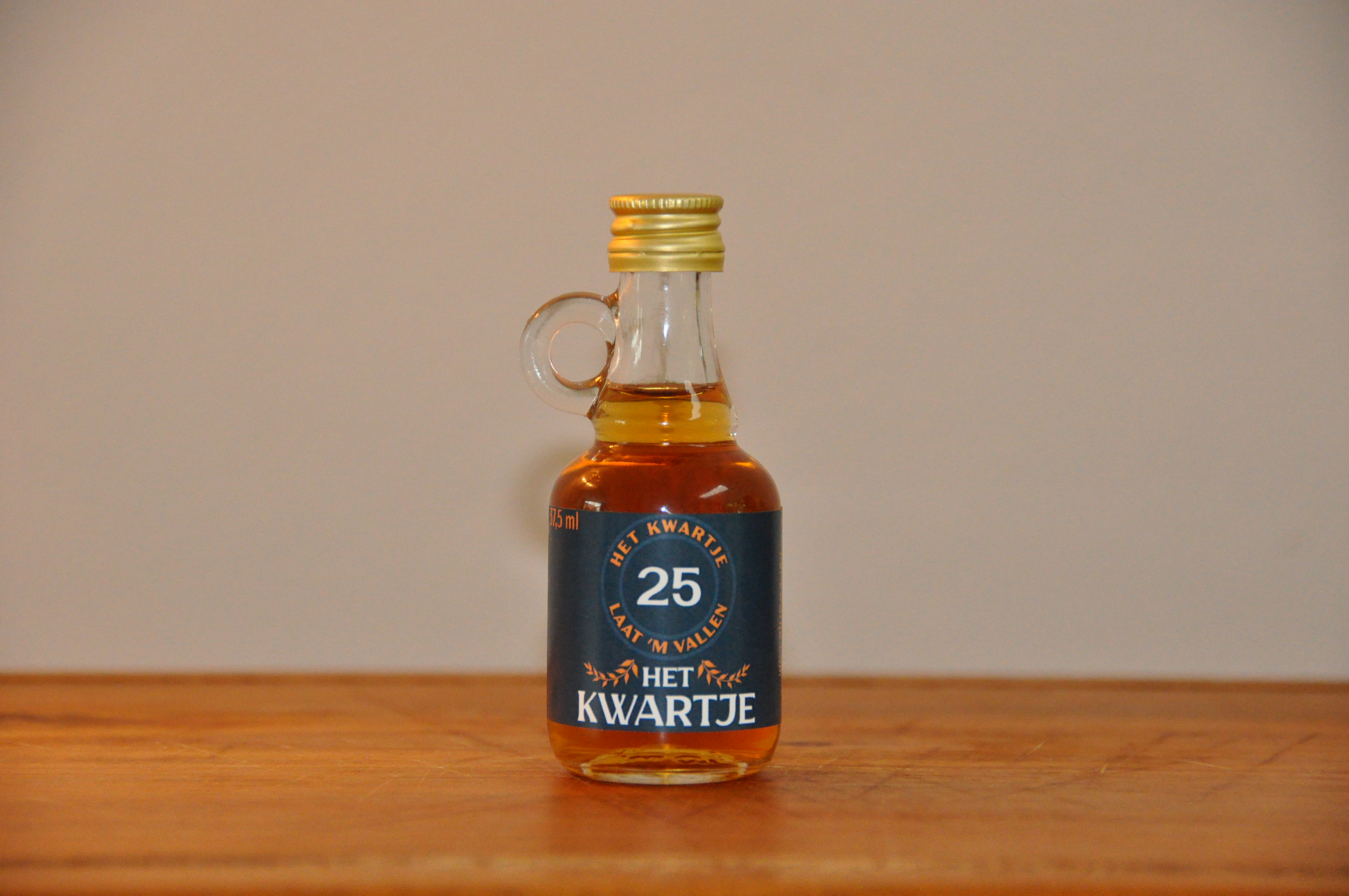
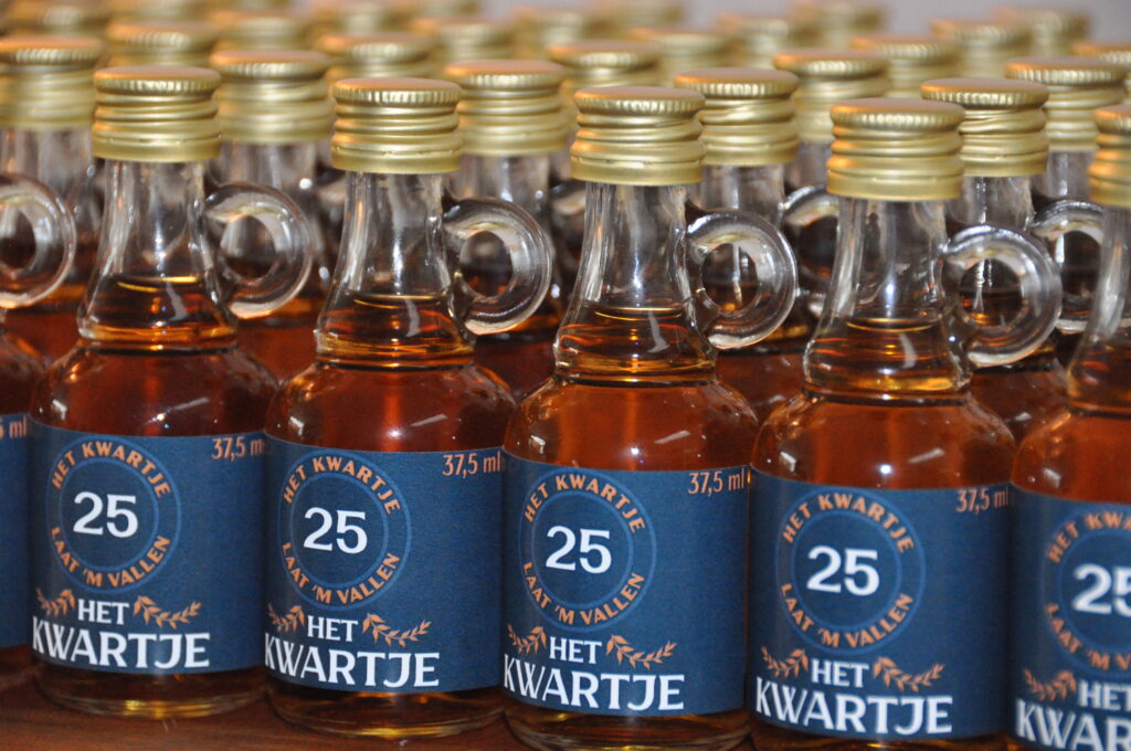
The design
While the taste was distinctive enough, the brand needed something recognisable.
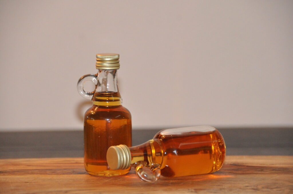
The origin of the brand is mead, as it was the first type of alcohol I ever created. Traditionally, mead and wine are fermented in glass demijohns. These containers usually have a glass handle or ‘ear,’ to make carrying them easier.
Eventually, I chose a bottle with a similar handle, as an homage to the brand’s origin.
Third phase
The branding
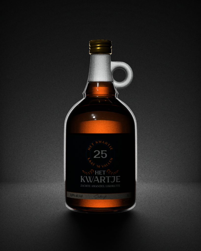
While the bottle design, together with the golden cap, drew attention, the label needed to carry the same load of heritage, quality, and festivity.
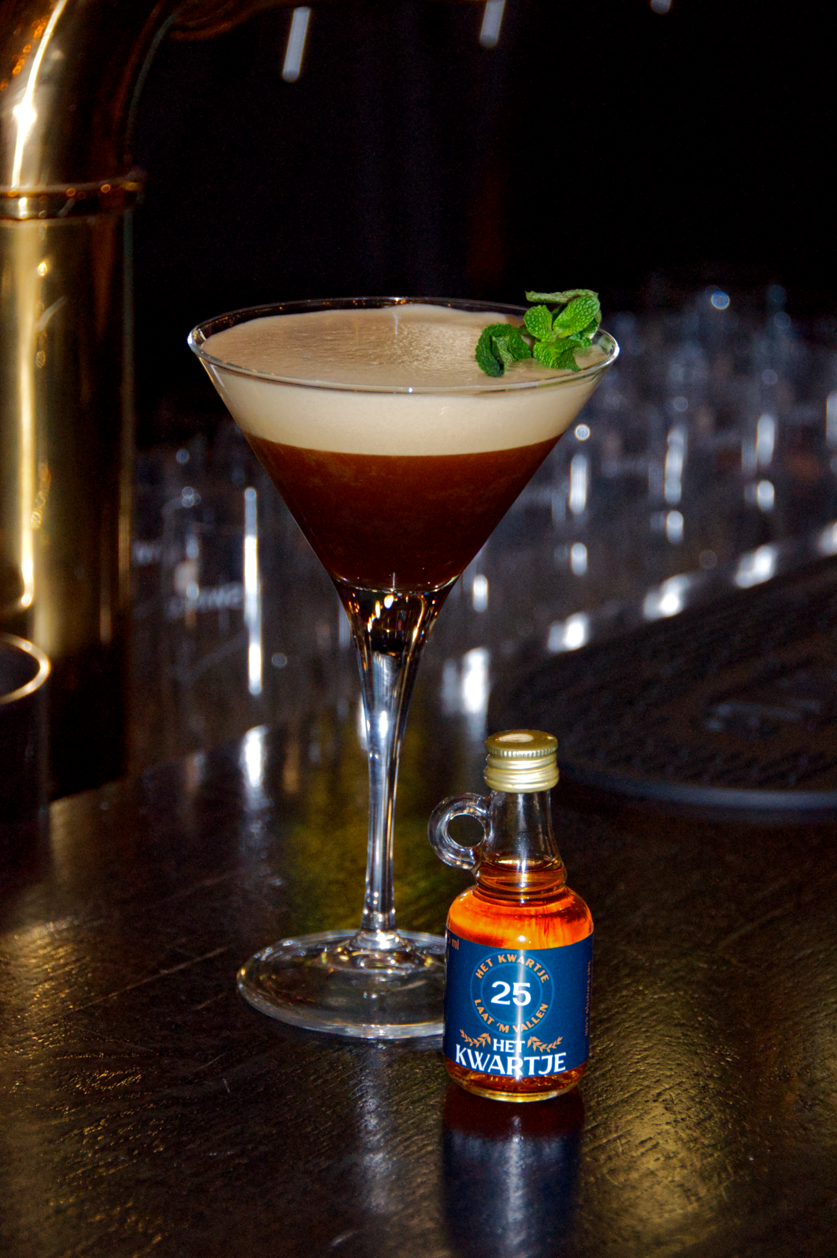
Inspired by the name’s origin, “Het Kwartje,” a popular name of an old Dutch coin, the iconic number “25” was added to the label. Together with the laurel leaves, depicted on the coin’s design, the label became recognisable, even for a label only a couple of centimetres in height.
Fourth phase
The catalogue
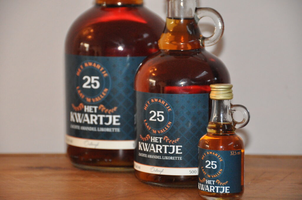
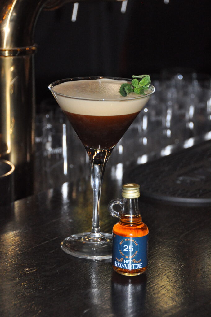
When the first shot bottles of Het Kwartje were released, the demand for bigger-sized bottles came quickly.
This allowed me to add more information to the label, some of which I previously had to remove because of the limited size available on the original shot bottle.
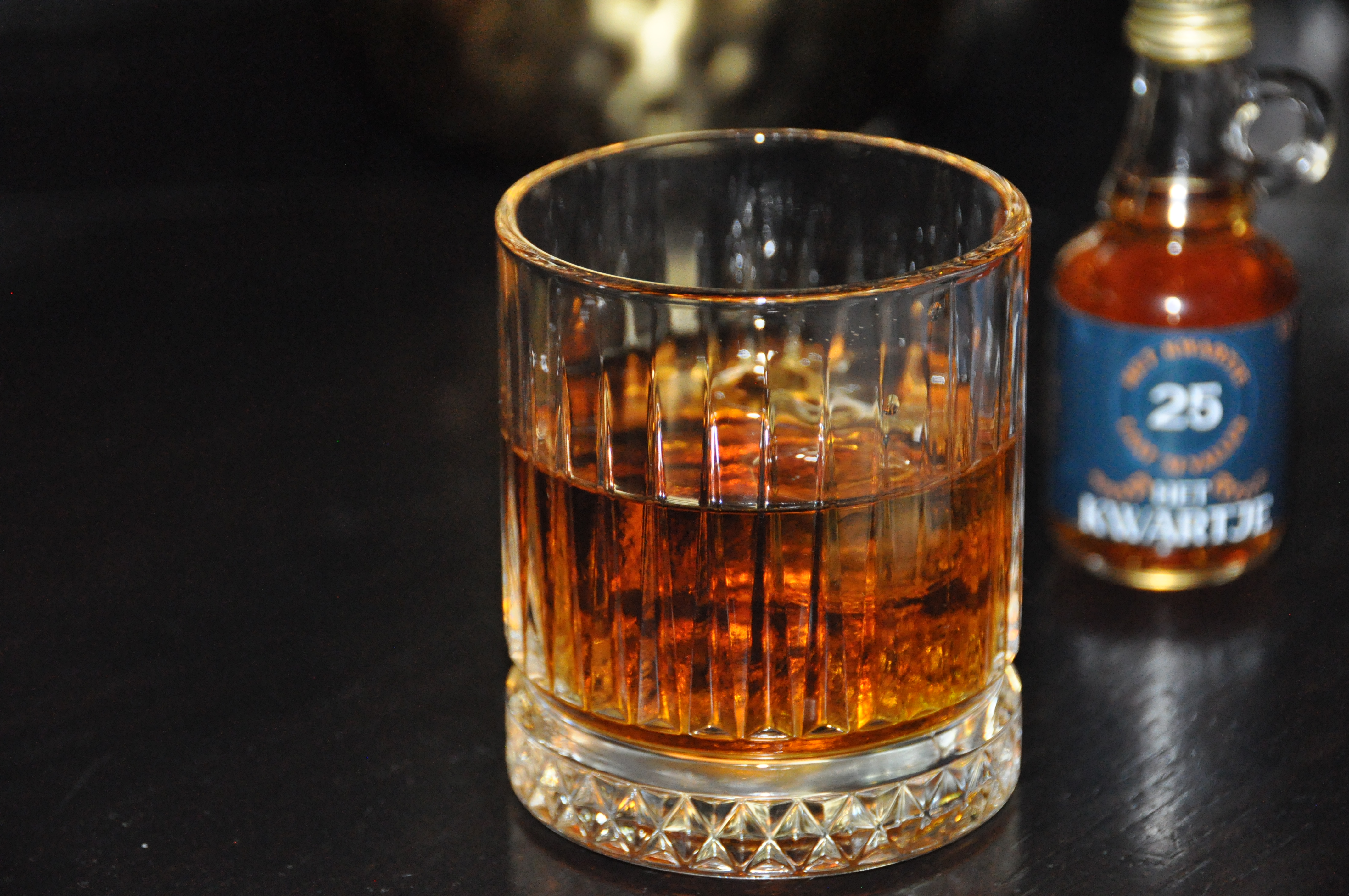
The larger bottles have two labels instead of a single label wrapping around the entire bottle. Each label restricts the amount of light entering the bottle, giving them their distinctive dark caramel colour. The thick and heavy glass and wide bottle make it less easy to hold the bottle from the waist, incentivising the consumer to hold the handle or neck.
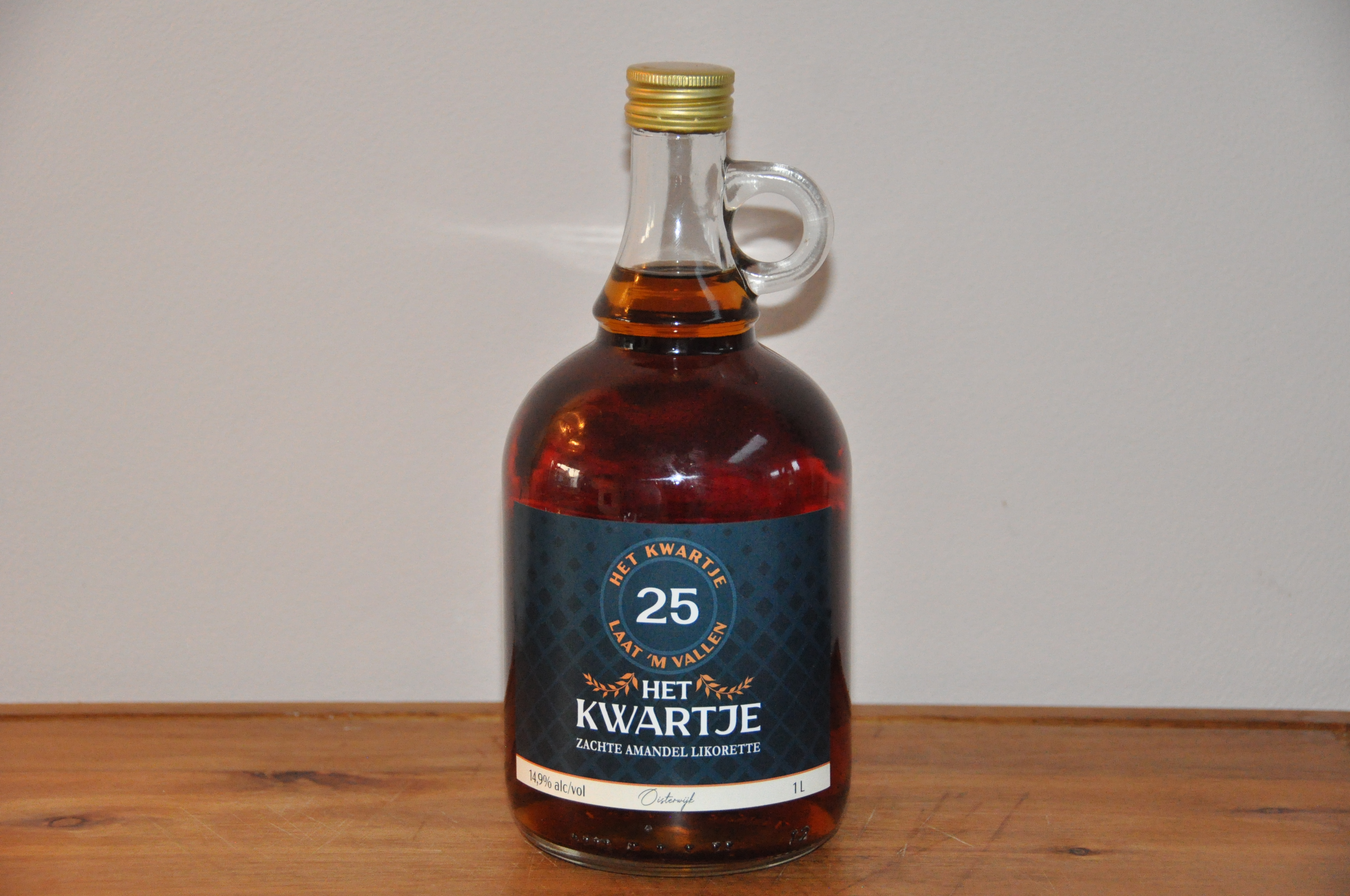
Looking back, I underestimated how much the physical design of the bottle would shape the brand’s identity. The decision to use a handled bottle started as an homage, but became central to how customers recognise and hold the product. In future packaging projects, I want to involve potential users earlier to test whether these design choices land the way I intend.